OG images
OG Image Examples: 10 Patterns Worth Copying (and How They Are Built)
June 16, 2026 · 5 min read · Grabbit Team
The OG image is the first thing anyone sees before they decide to click a shared link. The best ones are not the prettiest; they are the most legible at a glance and the easiest to produce at scale. This is a tour of ten patterns that consistently work, what makes each one effective, and the build approach behind it, so you can copy the result rather than the pixels.
What separates a good OG image from a bad one
Before the examples, the rules they all follow. An OG image is usually viewed small, in a busy feed, for a fraction of a second:
- One focal point. Usually the page title in large type. If a reader has to hunt, you have lost them.
- High contrast and big text. It will be shrunk to a thumbnail. Thin gray text on a white card disappears.
- On-brand, not generic. Color, logo, and typeface that match the site, so the card is recognizable.
- Correct dimensions. 1200 by 630 pixels, the 1.91 to 1 ratio every major platform renders full-width. See OG image sizes for the full breakdown.
The patterns below are different ways to satisfy those rules.
10 patterns worth copying
-
Title-on-brand-gradient. The page title in large type over the site's brand gradient, with a small logo in a corner. The workhorse pattern: instantly readable, instantly recognizable, trivial to template. Most developer tools and SaaS blogs use a version of this.
-
Title plus author avatar. Adds the author's name and photo beside the title. Works well for blogs and newsletters where the writer is part of the draw.
-
Code snippet card. A syntax-highlighted snippet of the actual code the post is about. Strong for engineering content because the preview previews the substance, not just the headline.
-
Product screenshot inset. The title alongside a real screenshot of the product or dashboard. The honest version of "show, do not tell," and a natural fit when the page is about a UI.
-
Big-number stat. One large metric ("3x faster," "10,000 captures") as the focal point. Great for case studies and launch posts where a number is the hook.
-
Category label plus title. A small colored pill ("Guide," "Changelog") above the title, so the reader knows the content type before clicking. Good for sites with mixed content.
-
Minimal wordmark. Just the logo and a short tagline on a clean background. Best as a strong site-wide default for pages that do not warrant a custom image.
-
Quote card. A pulled quote in large type, attributed. Effective for interviews, essays, and testimonials.
-
Map or chart render. For data or location pages, the actual visualization as the card. This is one that pure design tools struggle with, because the image needs to be a real render of dynamic content.
-
Live page top-shot. The OG image is a clean screenshot of the top of the actual page. Zero separate design: the page is the preview. Ideal for landing pages and docs whose hero already looks good.
How these are actually built
Patterns 1 through 8 are layouts: a title, maybe an avatar or a stat, on a branded background. The maintainable way to produce them per page is a single template that takes the page data as input, rather than designing each card by hand. You can render that template two ways: a code-based image renderer (such as a framework's built-in OG route), or by pointing a screenshot API at a template URL you build with your normal components. The dynamic OG image generator approach walks through the template-and-capture version end to end.
Patterns 9 and 10 are different. A map render or a real screenshot of the live page is not a layout you can easily rebuild in a code renderer; it is the actual page. For those, a screenshot API is the natural fit, because it renders the real URL in a browser and hands back the image.
Generating the "live page top-shot" (pattern 10)
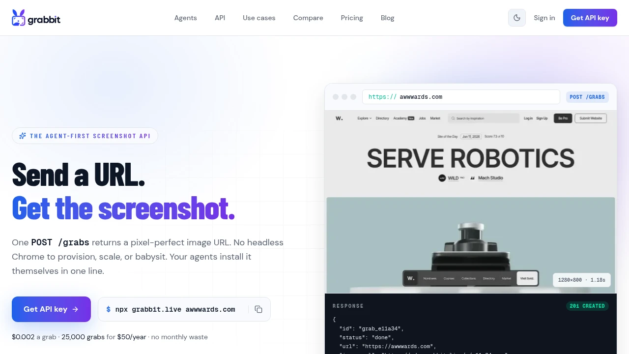
The simplest pattern to ship is also the one design tools cannot do: capture the real page. Point a screenshot API at the URL at OG dimensions:
curl https://api.grabbit.live/v1/grabs \
  -H "Authorization: Bearer sk_live_..." \
  -H "Content-Type: application/json" \
  -d '{
    "url": "https://yoursite.com/your-page",
    "width": 1200,
    "height": 630,
    "format": "png",
    "delay_ms": 500
  }'
The response gives you a hosted image_url to drop straight into your og:image tag:
{
  "id": "grb_01jx...",
  "status": "done",
  "image_url": "https://cdn.grabbit.live/grabs/grb_01jx....png",
  "width": 1200,
  "height": 630,
  "format": "png",
  "bytes": 73900,
  "execution_ms": 1210
}
Width accepts 320 to 1920 and height 240 to 1080, so 1200 by 630 is in range. delay_ms (0 to 10000) lets fonts and client-rendered content settle before the shot. Capture once per page, cache the image_url, and serve it from there.
The takeaway
Pick the pattern that fits your content, but make it per-page and make it automatic. A custom card with the post's title beats a generic logo every time, and the only way that scales past a handful of pages is a template you render on demand or a screenshot of the page itself.
New to the format? Start with what is an OG image. Ready to build one? The dynamic OG image guide has the full template-and-capture flow.
FAQ
- What makes a good OG image?
- A good OG image is legible at a small size, has high contrast, uses one clear focal point (usually the page title), stays on-brand, and fits the 1200 by 630 pixel, 1.91 to 1 ratio so platforms render it as a full-width card. Avoid small text and busy backgrounds; the image is often viewed at thumbnail size in a crowded feed.
- What size should an OG image be?
- 1200 by 630 pixels. That is the 1.91 to 1 aspect ratio Facebook, X, LinkedIn, Slack, and Discord render as a large preview card. Set og:image:width and og:image:height in your meta tags so platforms reserve the right space before the image loads.
- How do sites generate a unique OG image for every page?
- They build one HTML or JSX template that takes the page's data (title, author, section) as input, then render it to an image per page, either with a code-based renderer or by pointing a screenshot API at a template URL. The image is generated once and cached, so each page gets a custom card with no manual design work.
- Should every page have its own OG image?
- High-value pages benefit most: blog posts, docs pages, product pages, and anything shared often. A per-page image with the post title outperforms a single generic logo because it gives the reader specific context. For low-traffic pages, a good default site-wide image is fine.
- How do I make OG images without a design tool?
- Build a template as a normal HTML and CSS page that accepts data through URL query parameters, host it at a route like /og, and capture it with a screenshot API. You get a real, pixel-accurate render of your design as a hosted image URL, with no design tool in the loop.
Capture any website with one API call
Get a free test key and capture your first screenshot in two minutes.
Written by
Grabbit Team
Screenshots as a service
The team behind Grabbit, the screenshot API for developers and AI agents. We write about web capture, rendering, and automating screenshots at scale.
Keep reading
What Is an OG Image? Why Your Shared Links Look Broken
An OG image is the preview image that appears when a link is shared on social media. Learn what it is, why it breaks, and how to automate one per page.
Jun 13, 2026 · 5 min read
How to Generate Dynamic OG Images from Any URL
Generate a unique Open Graph image for every page by pointing a screenshot API at your HTML template. One template, zero design work, scales to any number of pages.
Jun 12, 2026 · 4 min read
Open Graph Image Sizes and Dimensions: The Complete 2026 Guide
The right Open Graph image size is 1200 by 630 pixels. Here are the exact dimensions for Facebook, X, LinkedIn, Slack, and Discord, plus how to generate OG images from a URL.
Jun 10, 2026 · 4 min read